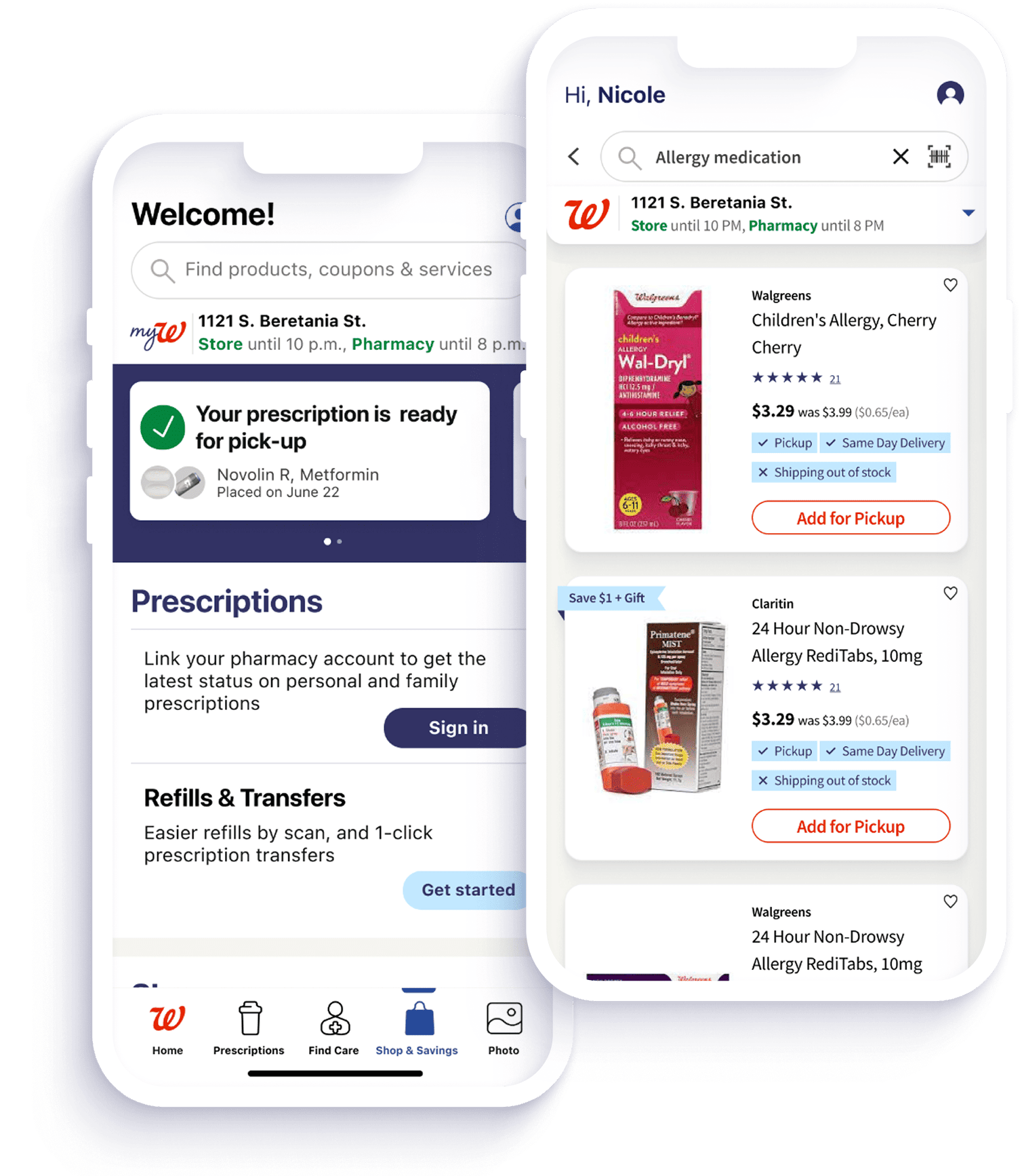
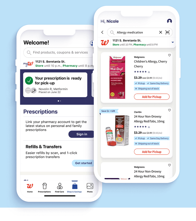
< Back to featured work

Redesigning a high-volume mobile pharmacy experience

A full UX overhaul focused on clearer information architecture, faster core task completion, and a more reliable shopping and pharmacy journey for Walgreens customers.

Mobile Design UX Strategy User Interviews Information Architecture Figma
Walgreens mobile app redesign preview
Role
Senior UX/UI Designer
Platform
iOS and Android app
Scope
End-to-end mobile redesign
Team
Product, design, research, engineering
Focus
Retail, pharmacy, checkout, loyalty

Context

Designing for everyday healthcare moments

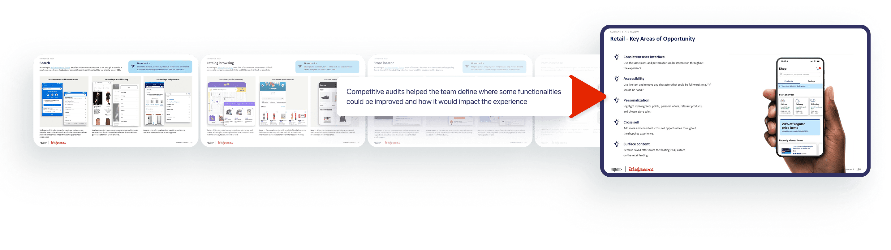
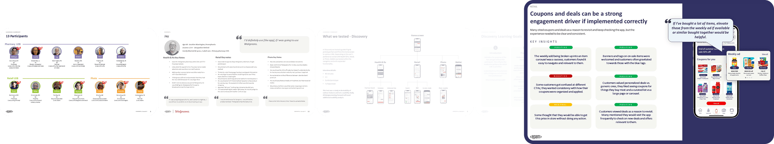
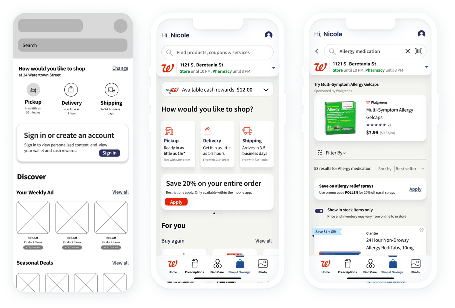
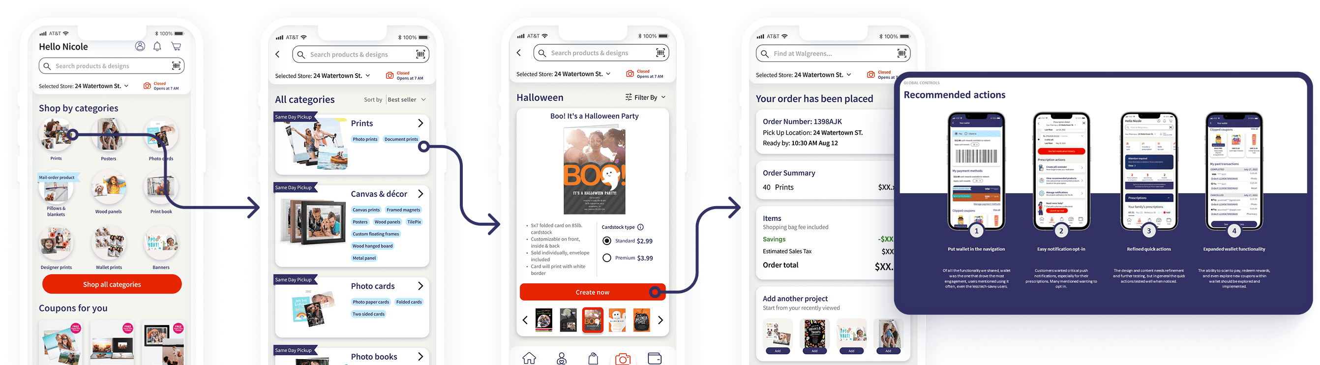
Walgreens customers move between shopping, prescriptions, coupons, pickup, delivery, and account tasks in one compact mobile experience. The redesign needed to reduce friction without breaking familiar workflows.

My role was to help reshape the experience through clearer navigation, better task hierarchy, reusable mobile patterns, and closer alignment between customer needs and business priorities.

The Problem

Core tasks were harder than they needed to be

Users had to work through fragmented paths to refill prescriptions, find savings, manage cart decisions, and complete checkout. Small moments of confusion added up across a journey used repeatedly by millions of customers.

The product needed a simpler structure, clearer decision points, and a mobile UI that supported speed, confidence, and accessibility.

Impact

Measuring success by customer momentum

The redesign focused on measurable improvements: making essential tasks faster, lowering avoidable abandonment, and improving the customer perception of the mobile app.

NPS
58

Improved from a negative baseline after the redesign effort.

Task Time
-25%

Reduction in time required to complete important mobile flows.

Cart
-18 pp

Lower cart abandonment through clearer checkout and decision support.

System
Reusable

Patterns created for scalable mobile design and future product work.

Kick Off

Getting the team around the same customer journey

The first step was mapping the app experience around actual customer intent: refill, shop, save, pick up, track, and resolve account needs. That helped the team see where product surfaces were competing instead of supporting the same journey.

Walgreens research and discovery process

Defining the Approach

Building a foundation before pushing pixels

I treated the redesign as a system problem, not just a screen problem. The work moved from discovery into journey mapping, flow simplification, component decisions, and high-fidelity mobile prototypes that could be tested and discussed quickly.

Walgreens design process diagram

Team Alignment

Turning scattered requirements into product decisions

Pharmacy, retail, loyalty, account, and checkout needs all had to coexist. I helped translate competing requirements into a shared hierarchy so the most important actions were easier to find and complete.

Customer Needs

Find prescriptions, savings, and order information without searching through unrelated paths.

Business Goals

Improve completion, reduce abandonment, and make high-value mobile actions more visible.

Technical Fit

Use reusable mobile patterns that could support rollout across multiple flows and states.

Design System

Creating repeatable patterns for a complex app

The redesign depended on consistency: cards, action rows, status messaging, product modules, coupon moments, and pharmacy states had to behave predictably across the app. Reusable Figma components helped the team move faster while keeping the experience coherent.

Walgreens mobile app design screens

High-Fidelity Iteration

Designing in the fidelity needed for real feedback

For a familiar consumer app, rough wireframes were not enough to reveal trust, clarity, or checkout confidence. I used high-fidelity prototypes to test realistic decisions, refine information density, and validate mobile interaction patterns.

Walgreens app flow screens

Final Design

Bringing the mobile experience together

The final direction connected retail and pharmacy tasks into a clearer mobile ecosystem, with stronger navigation, simpler flows, and UI patterns built for repeated daily use.

Walgreens project screens
Walgreens mobile screen detail
Walgreens mobile checkout detail

Closing

Small mobile decisions can change the whole journey

This work reinforced how much impact lives inside everyday product moments. When the structure is clearer and the interface respects the user's intent, even complex healthcare and retail tasks can feel simpler, faster, and more trustworthy.