< Back to featured work

Designing real estate market trend analysis and lead generation

A responsive business intelligence platform for Cotality's Araya ecosystem, helping users identify market opportunities, understand competitive landscapes, and act on complex real estate data with confidence.

UX/UI Design Business Intelligence Responsive Design Accessibility Design System Figma
Cotality Market Intelligence product preview
Role
Senior UX/UI Designer
Platform
Responsive web platform
Scope
Market intelligence and data visualization
Team
Product, design, engineering, data stakeholders
Focus
B2B, B2C, business intelligence, accessibility

Context

Helping teams find opportunity in real estate data

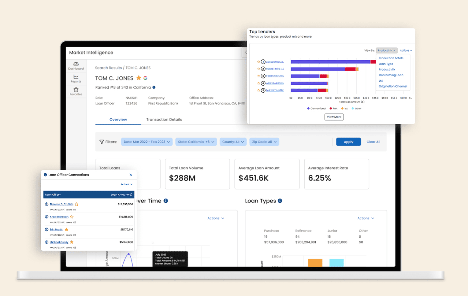
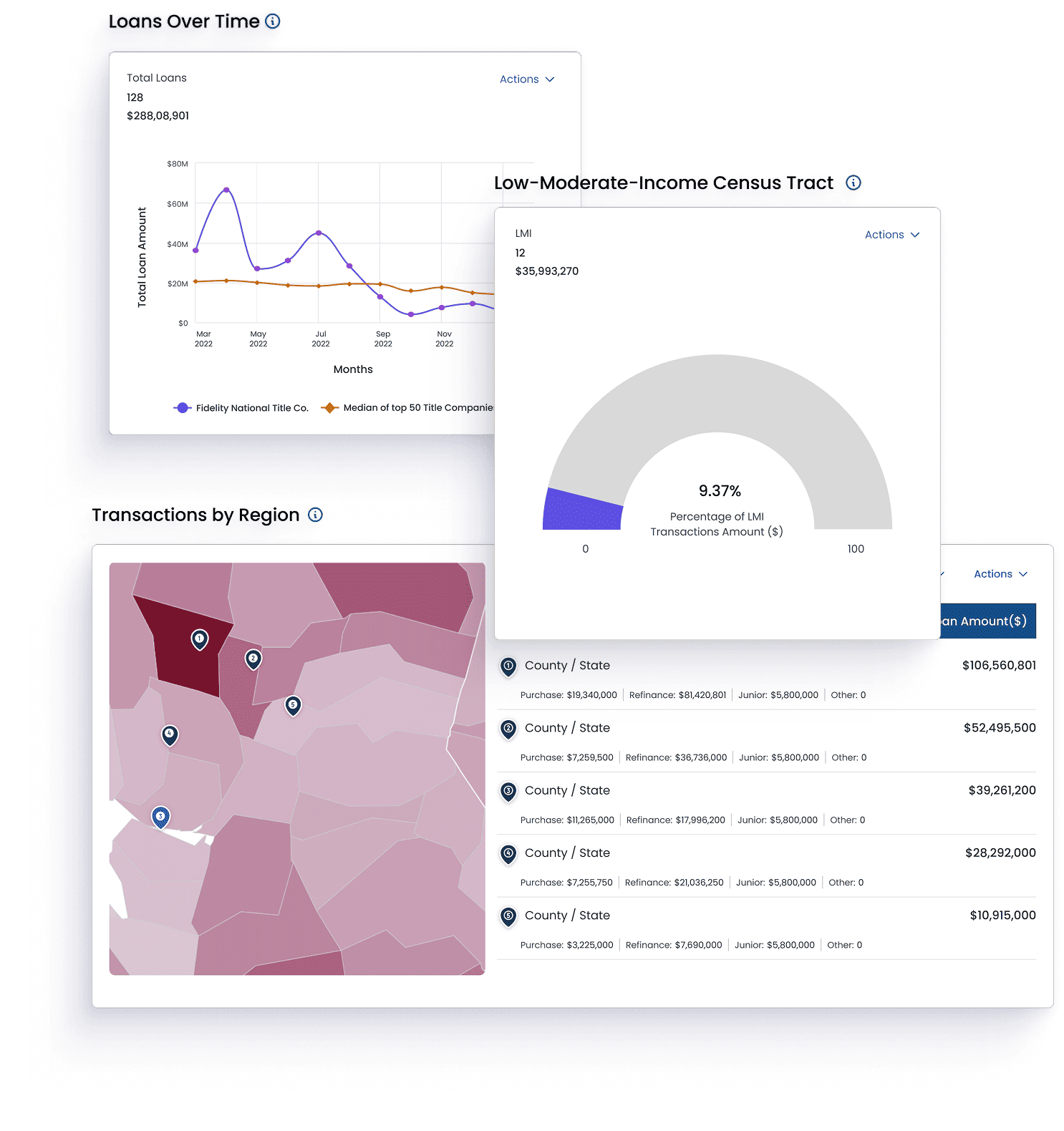
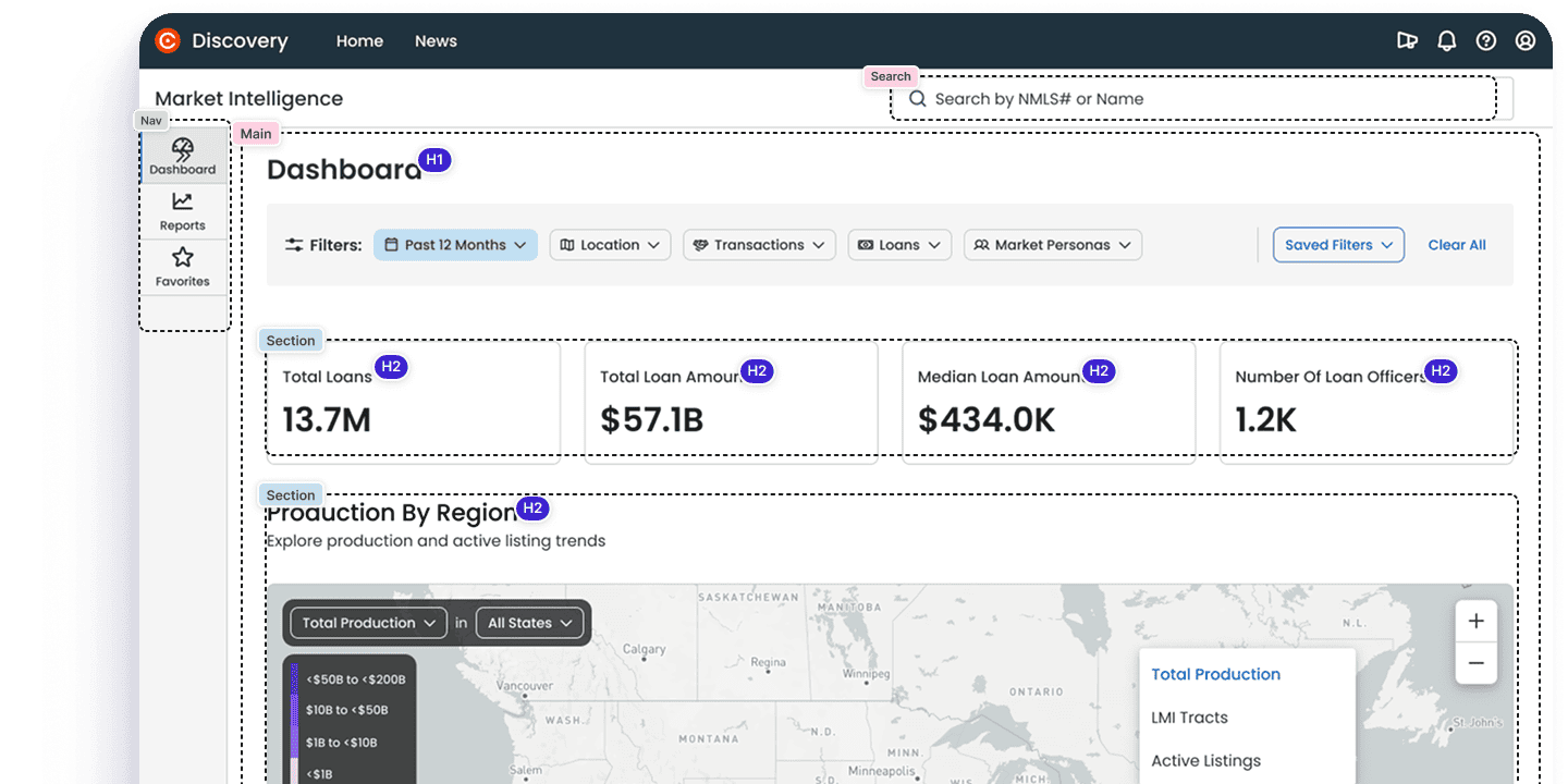
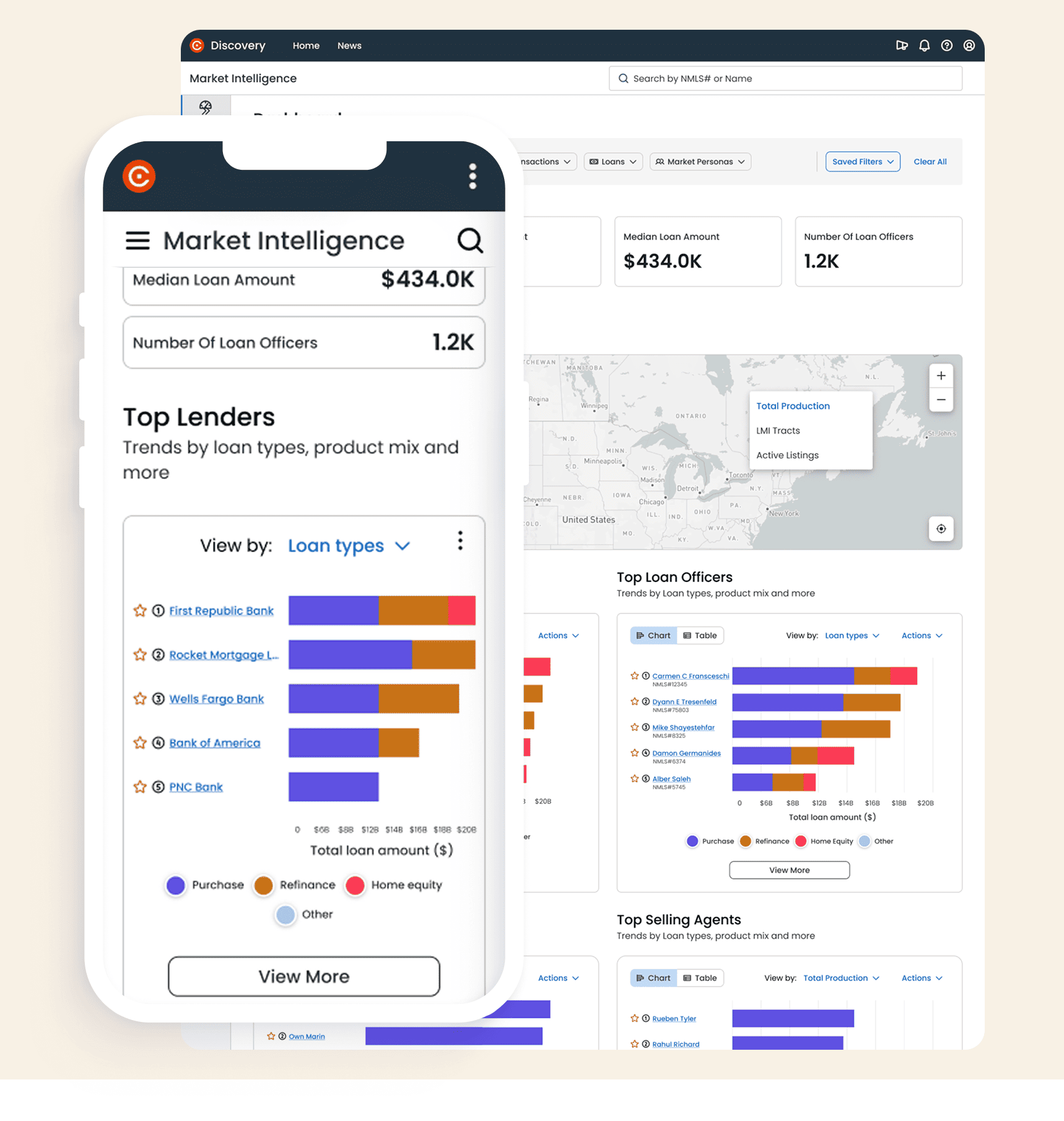
Cotality's Market Intelligence product is designed to help businesses identify new market opportunities by analyzing market trends, consumer preferences, and competitive landscapes.

The product needed to uncover untapped markets, emerging trends, and niche segments, then present those insights in a way that supported growth, innovation, and faster decision-making.

The Problem

Complex market data needed to become actionable

Users needed to identify emerging trends, market gaps, and new opportunities while staying current with the latest market insights.

The challenge was to create a product that made complex datasets readable, trustworthy, and easy to use across devices, so users could position their business for success.

Impact

Measuring success through clarity, trust, and adoption

The work reduced cognitive load in complex dashboards through progressive disclosure, stronger data-trust signals, accessible charts, and reusable UX patterns.

SUS
75

System usability score achieved for the data visualization experience.

Daily Use
+45%

Increase in daily active use after simplifying dashboard workflows.

Data Errors
-50%

Reduction in errors through clearer interpretation and stronger data signals.

Confidence
+80%

Increase in user confidence when reading and acting on the data.

Kick Off

Aligning stakeholders around the product vision

The discovery phase brought stakeholders into alignment around the product vision and intended outcome. The primary objective was to establish a shared understanding of the data, enhance usability, maintain focus on the core problem, and deliver a valuable, trustworthy experience.

We conducted structured activities including information architecture definition, competitor analysis, How Might We sessions, ideation, and prioritization workshops.

Cotality discovery boards and information architecture

Defining the Approach

Choosing the right visualizations for each decision

The solution needed to make data easy to interpret, actionable, and consistently up to date. A key priority was enabling faster, more informed decisions by reducing friction and simplifying complex datasets.

I focused on selecting effective data visualizations, improving readability through visual hierarchy, consistent patterns, thoughtful spacing, and clear prioritization of key performance indicators.

Cotality Market Intelligence dashboard and chart screens

Responsive Product Strategy

Designing one experience across desktop and mobile

Responsiveness and accessibility were essential. The experience was designed to work across devices, including mobile, while preserving the clarity users need when reading charts, maps, leaderboards, and market KPIs.

Market Insight

Help users identify emerging trends, market gaps, and opportunity areas faster.

Data Clarity

Use the right chart types, hierarchy, and spacing so complex datasets are easier to read.

Device Fit

Keep the platform usable across desktop and mobile without losing key business context.

Design System

Building with the Ensemble design system

The product was built using Ensemble, a design system developed and maintained in Figma to ensure consistency, scalability, and efficiency across the Araya platform.

Ensemble provided a shared language for design and development. Variables and design tokens standardized color, typography, spacing, elevation, and theming so teams could move faster while maintaining coherence.

Cotality Ensemble design system color and component examples

Accessibility WCAG AA

Making charts and page structure usable for everyone

There was a strong emphasis on making information accessible to all users. I followed WCAG AA standards so both content and data visualizations could be used by people with disabilities, including users with visual impairments.

The experience supported keyboard interaction, screen readers, voice-assisted technologies, semantic landmarks, descriptive labels, and a clear heading hierarchy. Chart work used Highcharts accessibility features including screen reader support, keyboard navigation, and alternative data formats.

Accessible Cotality chart and map data visualizations

Final Design

Bringing market intelligence into a coherent product

The final product connected dashboards, maps, lender rankings, loan officer details, filters, and responsive views into a unified experience for market analysis and lead generation.

Cotality dashboard annotations and information hierarchy
Cotality design tokens and component library
Cotality dashboard details and data cards

Closing

Trustworthy data experiences need structure, not just charts

This project reinforced how much structure matters in data-heavy products. Clear hierarchy, accessible visualization, responsive behavior, and reusable design-system patterns helped turn complex real estate data into insights users could understand and act on.